Logo Header
Adding your Company logo to DataForm application forms promotes your company’s brand to your employees and customers.
Logo Header
Adding your Company logo to DataForm application forms promotes your company’s brand to your employees and customers.
Before you can utilise this tool you will need to create a .png or .jpg with your logo header which will appear on the header of each form to be completed. To do this create an image of your logo and save it to your desktop.
When the Logo Header is dragged onto your canvas. Clicking on this field on the canvas will open the option to upload the logo file. Once uploaded it can be positioned and sized by using the options available.
Panel
A group of fields that logically present together. i.e. Personal Details.
Panel
When designing a form with a professional look and feel it is often preferable to break the form up into constituent parts.
e.g. Customer information: Customer Name, Contact Name, Contact email, Contact Telephone Number
By putting the form fields into relevant panels provides groupings of information that can be titled and treated as a group for editing. Columns can be formatted within individual panels without effecting the general layout of the overall form.
An entire panel can be made to hide, show, be enabled or disabled. It can be made reactive to data input.
i.e. If a tick-box labelled Male is selected from the choice of Male or Female then the Panel Labelled Female (containing Female related fields) can be hidden from the form being completed.

Column
Column
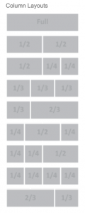
Columns can be created for purposes of maximising the use of the screen size and for aesthetic appeal. The auto re-size and auto-layout function, inherent within the DataForm application, ensures best usability and presentation. Whether from a large tablet screen in landscape down to a Smart phone in portrait the layout will be optimised to the display size and orientation.
On occasion there may be a compelling reason to maintain the column layouts selected. A column layout lock function enables the locking of the column layouts preventing the auto-layout for that panel or form.
Columns can be added within a panel which means tight control of the form layout. Columns within different panels can have varying layouts on the same form.
Page Break
Enables ‘hard’ page breaks to be inserted so that ‘new’ pages are forced to keep Panels together.
Page Break
The Page Break function is considerate of the need to print out received multi-page forms in a common format. Within the preview function of the form creator of the form is an additional function called ‘Paper’ to see how a form will be laid out when printed. You may find that it might need adjustment so that page breaks can improve the the form’s readability. Keeping certain panels together on one page might be preferred or conversely start the printing of a new panel on a new page keeping sections on a single page.
Another factor of the page break function is to maintain a uniform presentation of the received form on-screen display. As users may be using different screen sizes on a variety of mobile devices it is important that data presented on the DataForm platform is consistent for presentation.
Repeater
Enables an end-user to press the + key to add further rows of data fields or panels.
Repeater
During the form creation process it is very possible that particular form types contain repeating groups of fields.
In the example below, the line of data-entry fields can be repeated up to 10 times. This is for when a user of the DataForm app is completing this section labelled ‘Goods to be collected’ they only need to see 1 line for completion. If there is another line required (up to 10), tapping on the + symbol on the app at the bottom of the completed data entry group will cause another line to appear, ready for completion. Conversely if a line is to be removed the – symbol will remove a line.
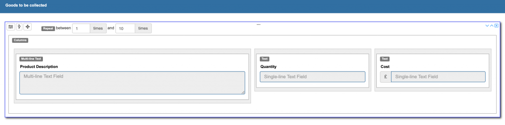
The repeater function can be applied to lines of data entry fields, fields within columns and even entire panels. Panels can even be nested within panels if required.
Panel Library
When creating forms there may be occasion when there are common fields held in Panels that exist on other forms.
Panel Library
When creating forms there may be occasion when there are common fields held in Panels that exist on other forms.
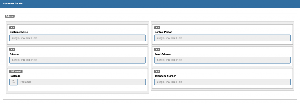
To cut down on the time to create a new panel or form you have the option each time a panel is created to save it to the Panels Library. This may consist of Panels you’ve labelled: e.g.’Customer Details’ containing pre-configured fields such as Customer Name and Address, Postcode, email address, Contact telephone number/mobile number, Date, Time, Order Number etc.
When creating a new form you’ll be able to access the Panel Library through the Toolbox and drag and drop the pre-defined Panel to the work area without having to recreate the Panel with each individual field already laid out.
A typical Panel.
Another might be a Signature Block.
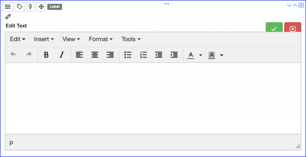
Label
This field enable text to be added for reference to the body of a form in an exact location.
Label
This field enable text to be added for reference to the body of a form in an exact location.
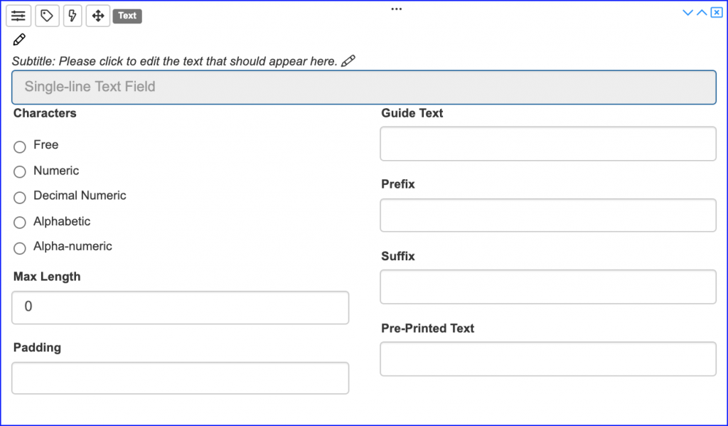
One-line Text
A single line text box can be added with control of whether it is a numeric or alpha field with a limit of characters.
One-line Text
A single line text field is a commonly used field as it enables information to be entered or questions to be answered and entered. Consideration should be given to the length of the field and how many one-line text fields to be entered. It could be that short lines could be added to one actual panel column or across an entire panel where no columns have been set up.
A variety of options can be selected, like a pre-fix e.g a £ symbol or a suffix e.g. gms. Entry length and numeric fields can also be assigned. Where a single line text field may be pre-populated the Pre-filled text function can be set to have data from a database intelligently (data relating to a particular form) ’pulled’ into the field so that it is not requiring user input.
N.B. This can be set to allow updating or made to be Read-Only denying modification to the field.
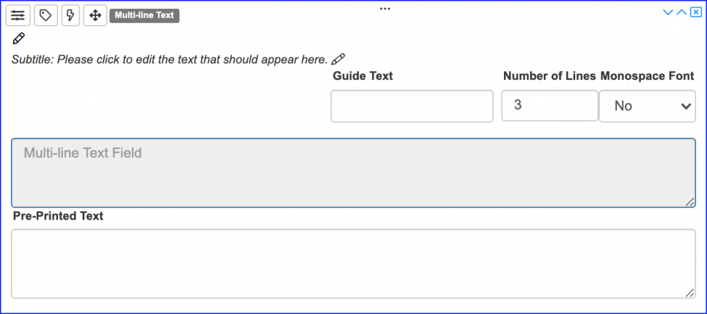
Multi-Line Text Field
Multi-Line Text Field
A Multi-line text field is enables information to be entered or questions to be answered and entered. Consideration should be given to the number of lines available that can be set. It could be that short Multi-line text boxes could be added within an actual panel column or across an entire panel where no columns have been set up.
A variety of options can be selected, like Guide Text which allows guidance information to be contained within the Text Box but appears in Grey and is overwritten by the user e.g Enter additional observations here. The maximum Number of Lines visibly available for text entry needs to be set here. Where a Multi-line line text field may be pre-populated the Pre-filled text function can be set to have data from a database intelligently (data relating to a particular form) imported into the field so that it is not requiring any user input.
N.B. This can be set to allow updating or made to be Read-Only denying modification to the field.
Postal Code
Postal Code
Within the Postal address field set-up within the designer it will be possible to have the associated address looked-up from a drop-down and determine where the address found is entered into a target Text field. This can be a chosen single-line or multi-line text field.
This will ensure that the address entered is formatted in the desired way by the Postal Service.
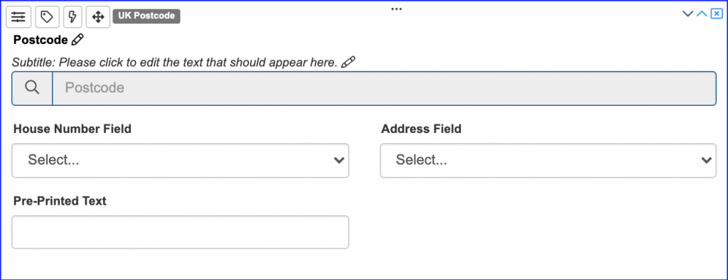
This field is designed to accept and validate A UK Postcode or an American Zip Code. It can also be pre-populated from another source and can be set to be Read-Only or allow updating.
This field is designed to accept and validate A UK Postcode or an American Zip Code. It can also be pre-populated from another source and can be set to be Read-Only or allow updating.
Fixed Text
Text that is fixed and non-editable.
Fixed Text
There will be occasion where text that is fixed and non-editable is added to a from this can be as brief or as expansive as necessary.
Use for this field is wide and varied. It could be a brief note with a Warning such as
“Before removing the cover please ensure the appliance is properly earthed before testing impedance”.
Or it could be a page or more of Legalese with a Terms and Conditions notice.
As can be seen, rich text with formatting options is available and it will allow text from another source to be just and pasted into the text area.
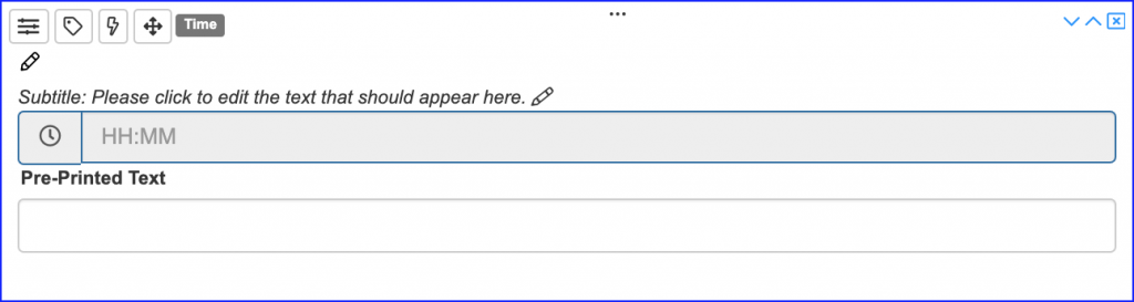
Time
Time
The time field, when dragged and dropped onto the canvas, will behave slightly differently depending on the smart phone or tablet being used for data-capture.
It can be dragged and dropped onto the canvas without any further set-up. When the user clicks on this field it will invoke the devices Clock function which normally defaults to current-time. This is a user adjustable field and usually has the added option to decide on the format, i.e. 24hr format or am/pm format.
The Time field also has some inherent formatting options that can be invoked at the form design stage.
It can be filled in manually like a normal text field. Please note that this will prevent the data in this field to be used with any calculations involving time. i.e. Total hours spent travelling to and from a place of work.
If there is a requirement to populate this field with the result from other Time fields (not free Text entries) being used as elements of a formula.
e.g. If there were multiple start stop times detailed on the form during completion then the total hours and minutes can be calculated automatically and the ‘Total hours spent’ would be automatically entered in the standard time format, 26hrs 45 mins, or decimal time, 26.75 hours.
Pre-filled Text can be selected on this field. It can be sent to the user and each individual form can have an associated time already completed on the form. e.g. Time of next appointment.
If pre-populated from another source and can be set to be Read-Only or allow updating.
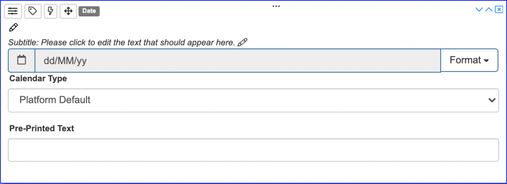
Date
This field can be added to record today’s date (default) or allowable future or past dates.
Date
The Date field is capable of capturing date entries in a variety of formats. e.g. English dd-mm-yy or American mm-dd-yy with additional formats available to cater for 4-digit year.
When clicking on this field the devices own method for capturing the date is invoked and usually defaults to current date. It is usually adjustable with forward or backward dates.
It can be filled in manually like a normal text field. Please note that this will prevent the data in this field to be used with any calculations involving dates. i.e. Total days spent between 2 dates or multiple pairs of dates.
If selecting the Platform default then the DataForm platform will automatically adjust dates to comply with the Platform’s default format which cannot be overridden.
Pre-filled Text can be selected on this field. It can be sent to the user and each individual form can have an associated time already completed on the form. e.g. Date of next appointment.
If pre-populated from another source and can be set to be Read-Only or allow updating.
Check Box
Enables the creation of Check Boxes for one or more to be ticked as appropriate.
Check Box
A Check box (sometimes referred to as a Tick Box) means: if applicable click on the box. It allows for multiple ticks and each Check Box can be selected or de-selected by clicking on the check box.
With one click the description of the associated information can be accurately conveyed.
e.g. Replace the following parts:
 Brake Pads
 Callipers
Tyres
Brake Fluid Hose
This could also be used for selecting from a list of symptoms:
Runny Nose Fever Tiredness Headache
Check Boxes allow for multiple clicks from a selection whereas Radio Buttons allow for a single choice from a selection.
Choice
Enables the creation of Radio Buttons or predictive Dropdown menus.
Choice
From Choice you enable a user to select ONE item from a range of items. The number of items can be as few as two items to hundreds of items.
The presentation of the Choice to select from can be presented as Radio buttons or as a Dropdown. If there are less than 5 items Radio buttons is likely to be the preferred choice; if more than 3 or more items are to be presented then it may be preferable to select the Dropdown menu option.
If there is a large list, in excess of 50 items (e.g. from a parts list) then the predictive text option which is based on character strings will whittle down the list to choose from.
example. before and after
In the case of Radio buttons with just one click the description of the associated information can be accurately conveyed. In the case of a Dropdown the item for selection can, in most cases be selected with 2 clicks.
Determining whether to opt for Radio buttons or a Dropdown is a question of presentation, usability and practicality. It is very easy to change and preview before making a decision.
Choice (advanced)
- A Dropdown menu can be automatically updated from an external database so that the options to select an item from can be maintained – if required this can be shown on a one-on-one basis and may require some programming skill. A list of options can also be dragged and dropped into a word-list which is available within DataForm.
- The Dropdown list can also be completely changed based on a previous choice:- e.g. If work is taking place on the Transmission of a vehicle and Transmission is selected then a subsequent dropdown would consist of parts only associated with Transmission. However, if Engine had been selected from Dropdown (1) then Dropdown (2) would only show parts associated with the Engine. It is possible to utilise this feature on several levels of Dropdown lists that retain their focus on the ‘job at hand’. e.g. Select Vehicle from a Dropdown (1) (BMW), Select the model from Dropdown (2) (X5), Select the area of Work from Dropdown (3) (Transmission) and finally select the exact part from Dropdown (4).
Using this feature enables a very focused dynamic form based exactly on the user’s needs and avoid overcomplicating the form from the user’s point of view.
By using Dropdown lists to select from (including the predictive text feature ensures a consistency of description without facilitating colloquial abbreviations or variants of descriptions. Only official and consistent descriptions are available to choose from.
Signature
A signature box can be added to the form during design to enable signature capture.
Signature
Adding a Signature-box is often necessary for sign-off. This could be signifying receipt of goods or a signature can represent works carried out or a signature of the person completing the form.
When a user selects the signature field the screen on the user’s device will expand to full screen. When using a stylus or finger to sign in a signature-box a better representation of the signature can be achieved with a larger box is presented for signature.
Drawing
Drawing
Attachments
Camera
Allows photographs to be taken and added as ’thumbnails’ to the user’s form.
Link Forms
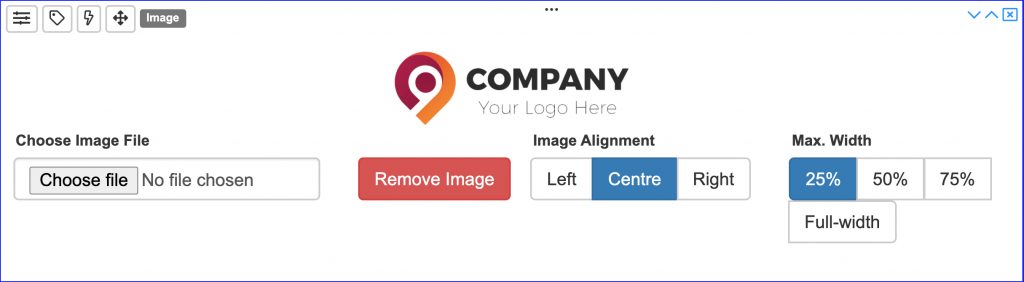
Image
An image can be uploaded and incorporated into a form so that the user can annotate the drawing as required.
GPS
Enables GPS coordinates to be ‘picked-up’ and entered into the field.
Serial Number
This field should be added when there is a requirement to add a unique incremented serial number to each form of the same type. Occurs on the the Dataform platform upon submission.
Barcode
A barcode can be scanned using the camera function on the device and the corresponding barcode number can populate a field.
Spacer
Spacer
Wildcard